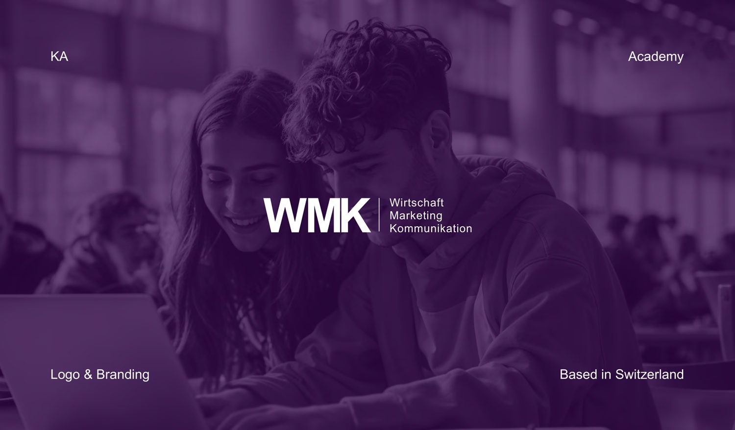
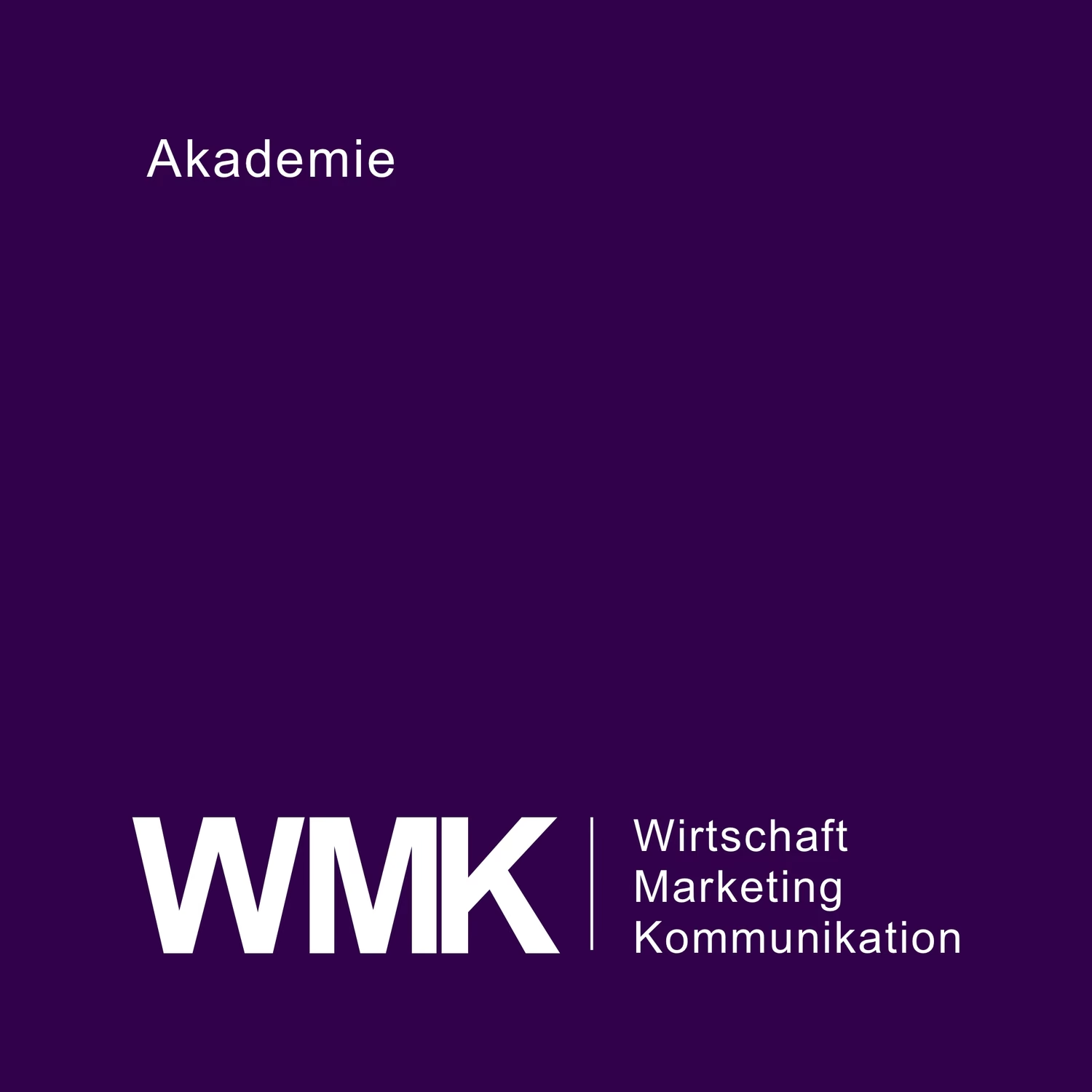
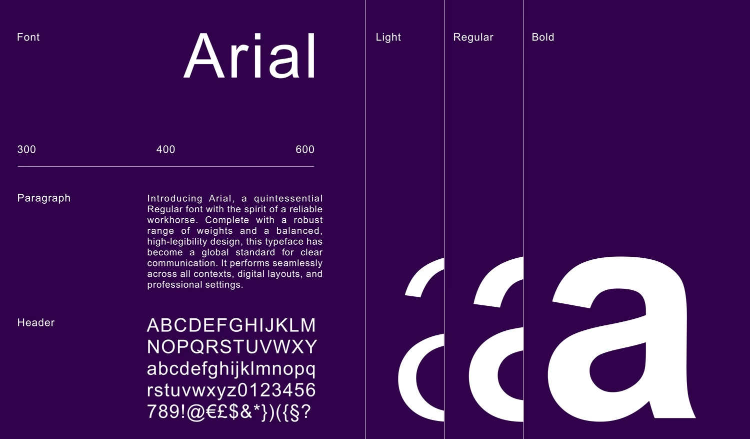
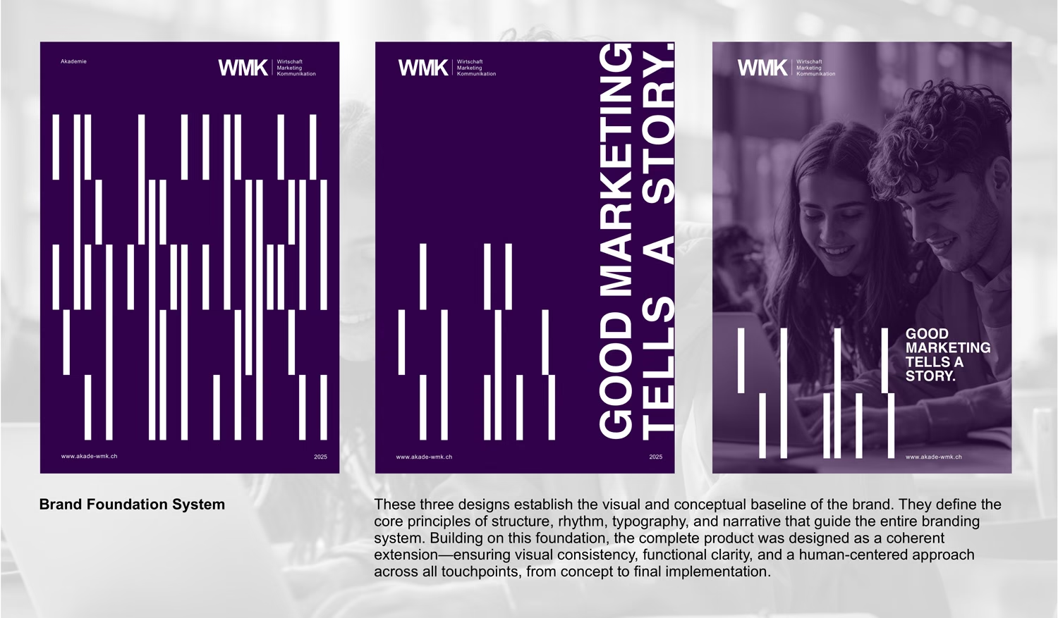
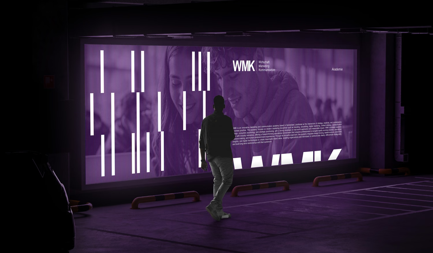
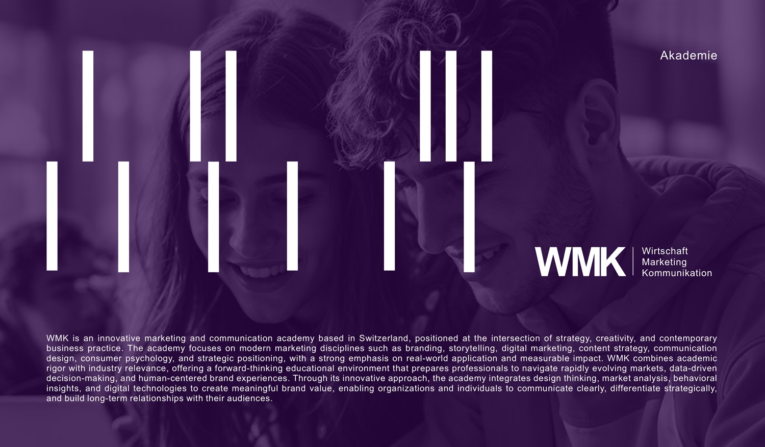
The mark is the three initials set in a heavy grotesque with tight spacing, so they read as one solid block. A thin vertical rule separates them from the three words they stand for, Wirtschaft, Marketing and Kommunikation, stacked in a lighter weight.
The logo explains itself. An acronym on its own expects the reader to already know the name. Here the meaning sits right beside it, so a first-time visitor learns what WMK teaches in the same glance that shows them the name. For an academy nobody had heard of yet, that did more work than a symbol could. Of the early directions we explored, this one answered the brief most directly, and it was accepted immediately.
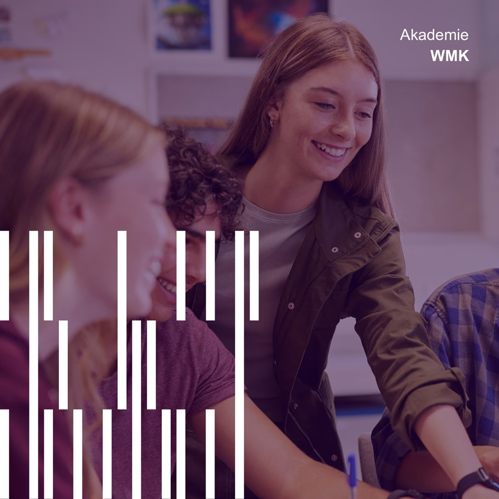
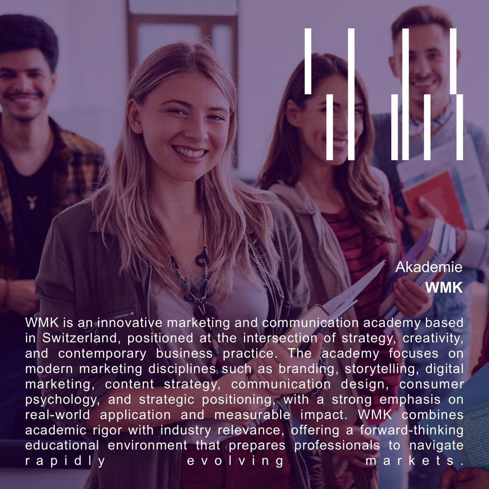
The logo also steps down with the space it has. Where there is room, the full lockup appears with all three words. In tighter spaces the initials stand alone, and over photography the brand often signs off with just Akademie and WMK in small type, leaving the images and the pattern to do the rest.
Because the logo stays simple, the character of the brand lives in three elements around it.
The first is a pattern of vertical white bars in different lengths, set in staggered rows. The bars stand for movement. Marketing and technology are fields that never stand still, and the people learning them are moving too, from one skill and one stage of their career to the next. Offset at different heights, the bars read as momentum rather than as a fixed grid. The pattern can be packed densely to fill a poster on its own, thinned out to sit behind a headline, or reduced to a handful of strokes over a photograph.
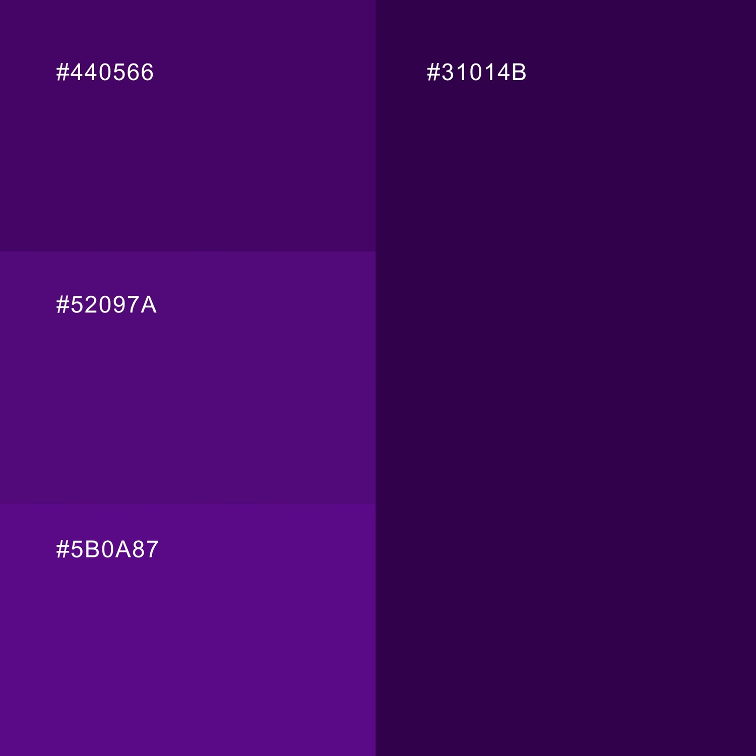
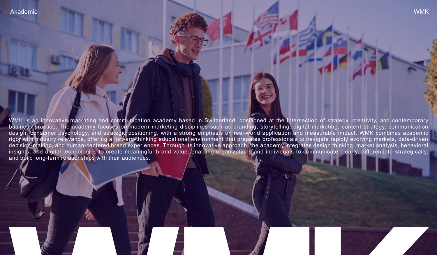
The second is photography. The images show learners in real settings, and every photograph is set in a purple duotone, so pictures from different sources share one voice while the people in them stay the focus.
The third is the logo itself used as a supergraphic: the letters W, M and K enlarged and cropped at the edge of the format, so even a fragment of a letter is recognisably WMK. Headlines complete the voice with short, confident statements, such as Good marketing tells a story, set in capitals and sometimes turned vertical to run the full height of a poster.