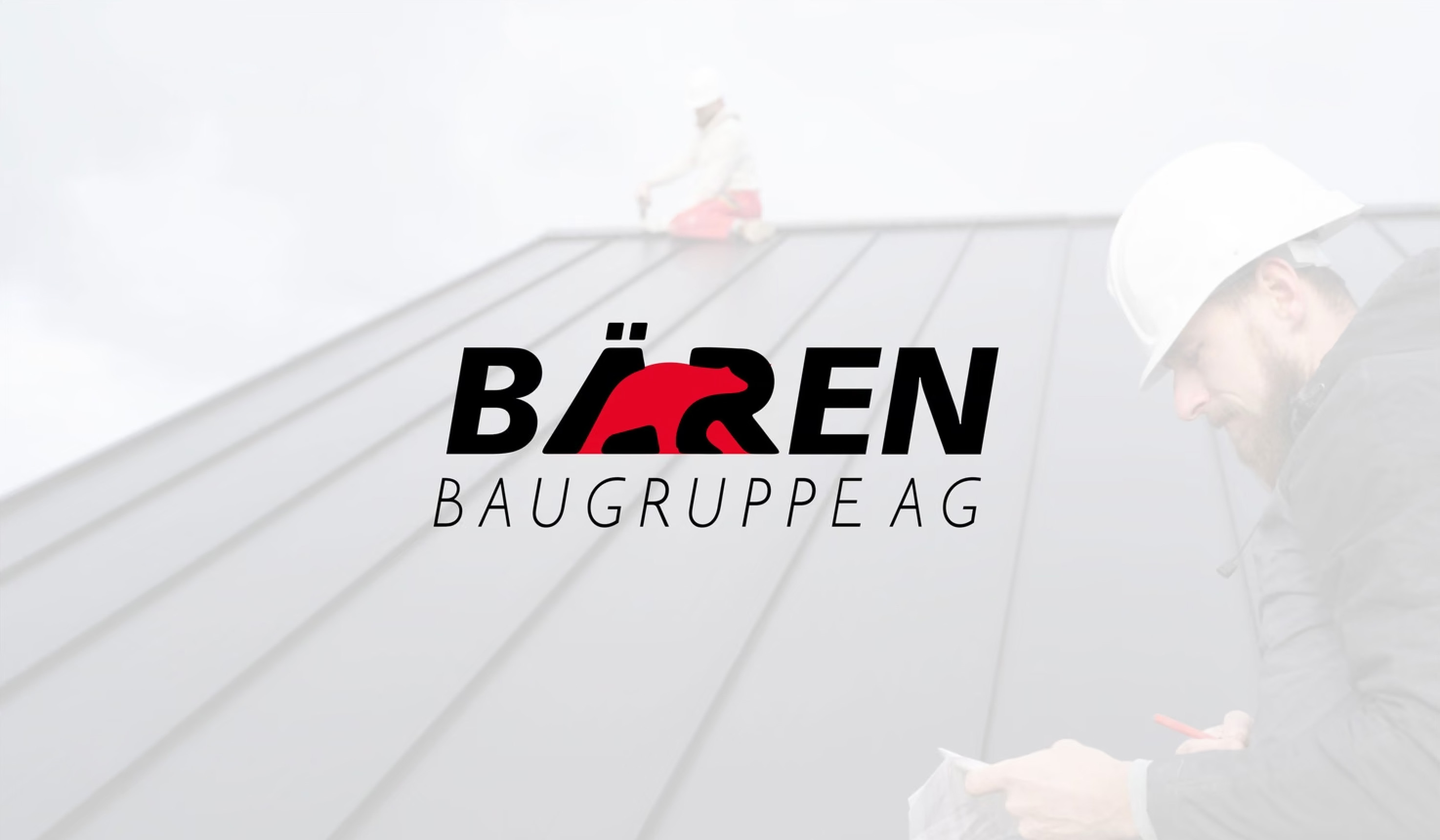
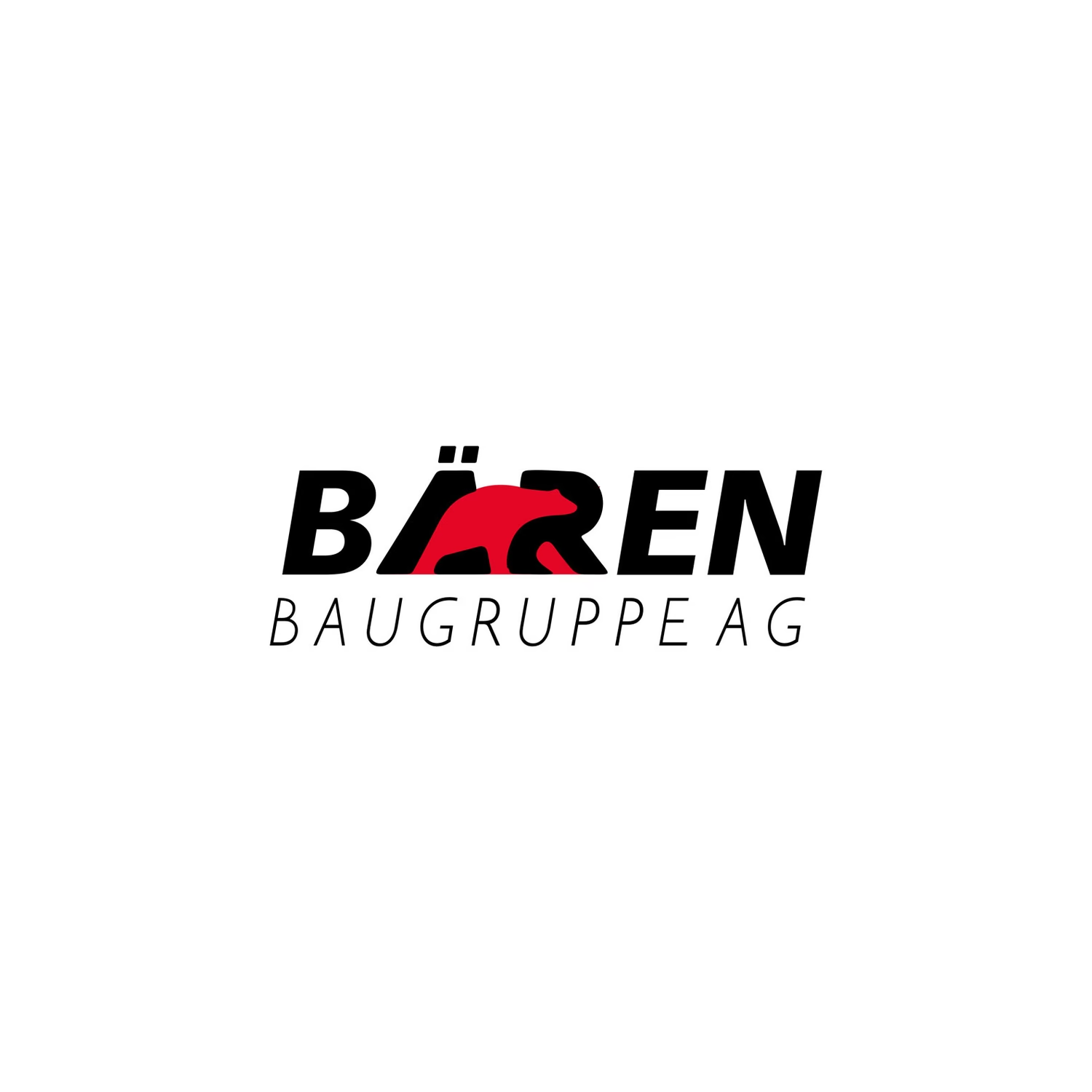
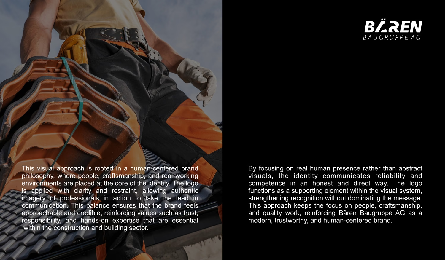
We started with the type. The plain lettering was replaced with a heavy, forward-leaning italic that gives the word real weight. Then, instead of placing a bear beside the name, we built it into the letters. A red bear walks through the middle of the word, taking the place of parts of the Ä and the R, with its legs standing in for their strokes and the umlaut dots still sitting above it.
The name and the animal are now one shape. Bären means bears, and the logo says it twice at once, in words and in image, without needing a symbol next to it. The italic slant and the bear’s direction of travel point the same way, forward in the reading direction, which gives the mark its momentum. Below it, Baugruppe AG is set light and widely spaced, a calm counterweight to the heavy name.
In the word. The primary logo: black letters with the red bear walking through them. This is the version for white grounds, print and anywhere full colour can be reproduced.
Carved into the letters. In one colour, white on black or black on white, the bear is not drawn at all. Its outline stays cut into the Ä and the R, so the animal is still there as negative space. The idea survives even when the colour can’t.
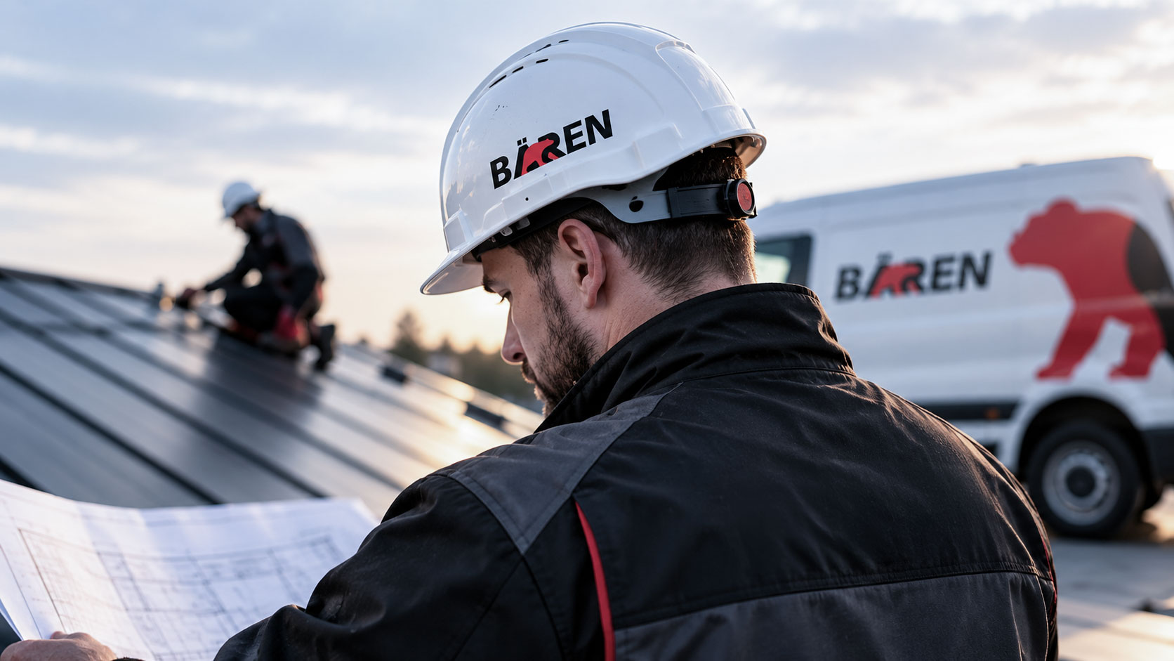
On its own. The red bear works as a standalone symbol, small enough for the brim of a hard hat and other spaces where the full name would be too wide.
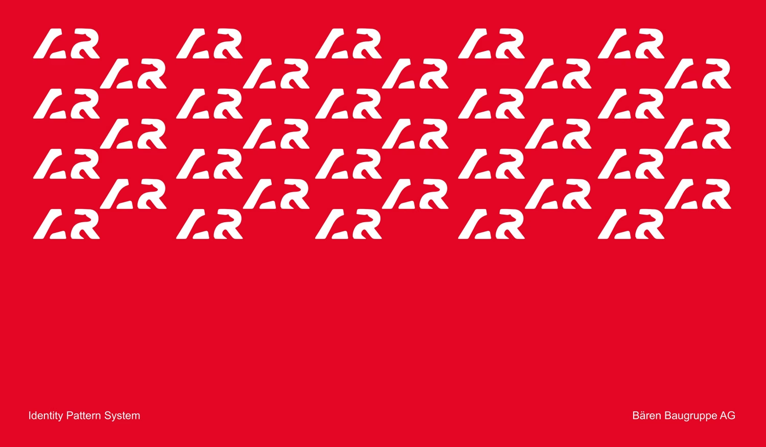
As a pattern. The letter fragments that frame the bear are repeated in white on red to form the identity pattern. The bear itself is left out, implied by the shapes around it, so the pattern belongs to Bären even though the logo never appears in it.